An easy dashboard for DOCSIS and network traffic
Have you ever noticed how a significant portion of your time is lost switching between different tools? Take a modem test, for example. The DOCSIS stats are found on one console-terminal, the traffic generator has a GUI, and probably a few more dashboards or admin panels. While each of these makes perfect sense on their own, each individual interface switch costs a bit of your precious attention, which comes at the expense of solving the problem at hand.
This inefficiency is a rather annoying and devious problem that we face frequently here at Excentis.
More dashboards, less fragmentation!
We used one of our ongoing projects to improve our way of working. This time it was a DOCSIS project. Don’t worry if this isn’t your cup of tea, the general idea applies to other technologies, so we’ll try adding analogies where necessary and we might even add a different Wi-Fi example later on.
The Project
The goal was to find the effect of the signal quality on the network traffic:
Can we detect a degradation of any customer service from DOCSIS monitoring?
Some might recall a similar question we asked in the past for a Wi-Fi environment, we wrote this article on W-FI/RSSI Error! Hyperlink reference not valid.What makes this different, though, is that DOCSIS offers much more than merely RSSI. Parameters such as Signal to Noise Ratio (SNR) and the Codeword Error Rate (CER) are readily available. These metrics reflect the conditions in the network well, in particular additional noise that disturbs communication will also degrade the SNR and CER. It’s no surprise that these values are often included in the KPIs to monitor, both in the field as in testing.
The parameters above are DOCSIS metrics. This is our first tool to use. As is tradition, they can be retrieved using SNMP. From where can they be retrieved, you may ask? From both sides of the coax! The codeword error rate for instance requires combining multiple values from the CMTS, a calculation that we described in this blog post.
Monitoring SNMP data is something most network tools support. In order get a good overview, however, a bit more is required: being able to easily process the results or even combine them with other data. These features are somewhat harder to find. To this end we investigated a new approach (well, new to us), and this is where Prometheus came into play.
Enter Prometheus and Grafana
![]()
![]()
Prometheus is a time-series database. It’s often used together with Grafana that provides the graphical frontend. Compared to traditional network monitoring tools, it’s a much more generic solution, but that might just be what we need.
Most tests require some development either way, if with a bit of extra work the specific tools could be combined into a single solution that works well with DOCSIS, or with Wi-Fi; that would be great. And even better woud be if we could also interface our Traffic generator and our DOCSIS sniffer.
This is how we got started. And how did it go? Let’s find out.
Prometheus and Grafana are open-source tools, installing and configuring the software went smoothly, as expected. It helps, of course, for the default configuration to make sense and the online documentation being very helpful. What is off the beaten path is adding the appropriate OID from the DOCSIS MIB. For this project, we required the ones from earlier mentioned blogpost (docsIfSigQUncorrectables, docsIfSigQCorrecteds, …).
Still, navigating through these can be somewhat daunting, that’s why we tend to spend a significant amount of time to it during our training sessions.
Blowing bytes
The DOCSIS parameters are only part of the exercise. For this test, we wanted to see the effect of the signal quality onto CER. Measuring this required sending network traffic. This can be done using our second tool, the ByteBlower.
Configuring the traffic is rather easy in this case. A single traffic flow in the GUI can be configured to all the modems in the test. Where we wanted to add Prometheus was in the monitoring this generated network traffic.
Getting test result data
To get results out of the ByteBlower GUI, there are 3 possible methods:
- In JSON after each test
In other projects we’ve used these for further processing with Python. But for this project that would mean having to wait until the end of a test. We’d wished to avoid such a long delay and rather follow the results in near real time. - Separately with the ByteBlower API
This we’ve used this in the past bring out system-level monitoring. But for this particular project, though, we did want to have a bit more fine-grained information. - Finally, the ByteBlower GUI has also an embedded real-time view, that has fine-grained information about the current test-scenario, but not yet in a data-export.
This last option seemed just what we needed. Working together with the people from ByteBlower, a simple proof-of-concept was built, focusing mostly on the flow results.
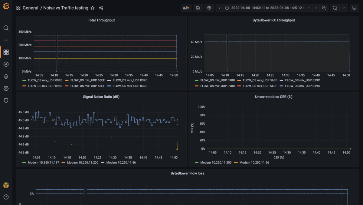
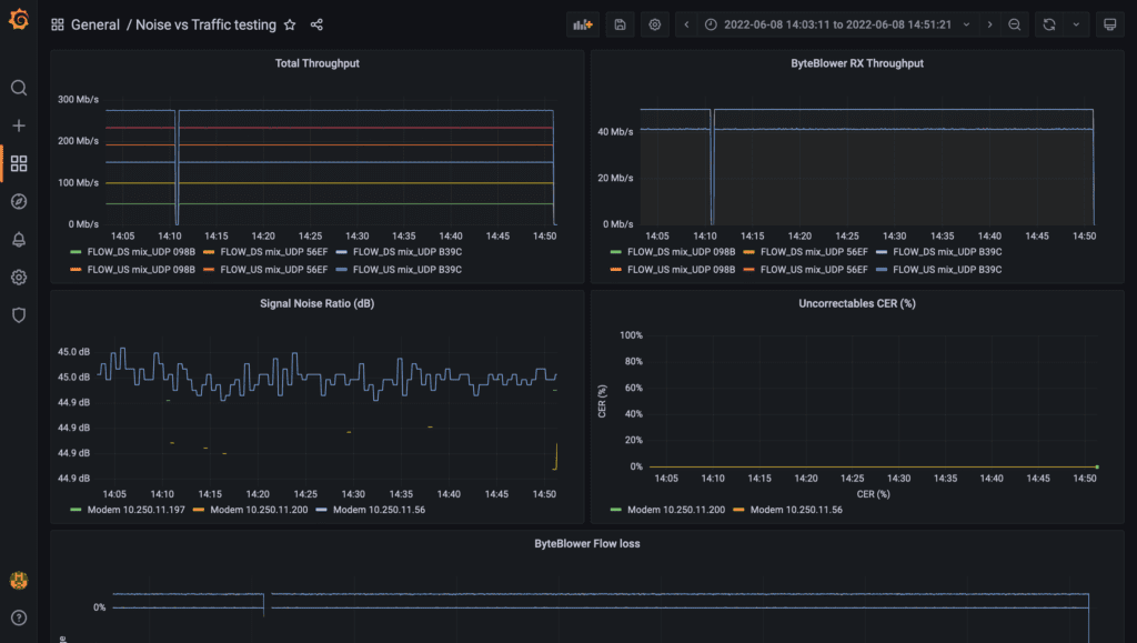
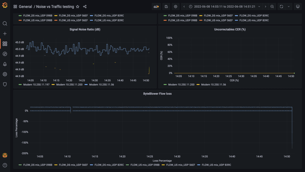
This is actually where Prometheus shined. As some may already know, in the real-time view of the ByteBlower GUI there’s two lines of information for each traffic flow: transmitted and received. With only that information, Prometheus and Grafana can take over most the rest. Diving into the wide range of capabilites of Prometheus and Grafana would take us too deep, so this is what we built:
- SNR is shown at the top graph.
As you might recall, these values were directly available from the system. - Codeword Error Rate (CER) in the middle.
Rather than showing each parameter individually, this single graph combines all three of the parameters in a single view. Prometheus does of most of the heavy lifting here. - A loss rate is shown in the bottom graph.
It’s an approximation, but again, Prometheus handles this quite nicely based on the same information as in the ByteBlower GUI.
DOCSIS Dashboard
For us at Excentis, this dashboard worked magnificently. In addition, the updated ByteBlower GUI will be made available in the near future.
We see a lot of opportunities with Prometheus and Grafana to increase the power and flexibility of your network monitoring.
So, what’s next?
Well that depends on you!
We’d like to continue expanding these dashboards, for both DOCSIS and ByteBlower, and with some luck even create a few for Wi-Fi or fiber. We are still thinking about ways to design, build and share upcoming dashboards, so if this post was interesting and you would like to learn more, we invite you to reach out to us so we can work together!
We look forward to hearing from you and helping you and your users benefit from these tools!